Music Merchandise Design
translating the language of music to the language of visuals
Adobe Illustrator, Adobe Photoshop, Short Video Editing, Social Media Marketing (TikTok, Instagram)
freelance graphic & product design
project duration: currently working on, since May 2021
Project Purpose
Music and Art go hand-in-hand in my life; when I started graphic design when I was 13, it was making social media graphics with my favorite lyrics on them. I used music, like design, as an escape; when other people could put into words the feelings that I couldn’t seem to describe, it felt like someone got me, like I had a home.
One thing I hated as a music fan was trying to support my favorite artists by repping their merch in my day to day life, only to find that the merchandise they were selling was not cute, at all. They all seemed to be words haphazardly slapped onto a shirt: a huge disconnect to how the artists’ music made me feel.
This is why I started designing— to create merchandise that I would want to buy as a fan— something that translated how the music made me feel, something special to the artist, something meaningful.
Graphics on Oxford Street (top) & Paddington Station (bottom) in London, UK.
A Girl Group Based in London
In my second collaboration with Y.Q.S, I designed a short-form animation for the D6 Kiosks in the London Underground and large printed graphics for the back-side of telephone booths.
Latest Client Project: Y.Q.S
Programs: Photoshop, AfterEffects


“Design @ First Listen” & Client Projects
May 12, 2021: I started my “Design @ First Listen” series on Tiktok.
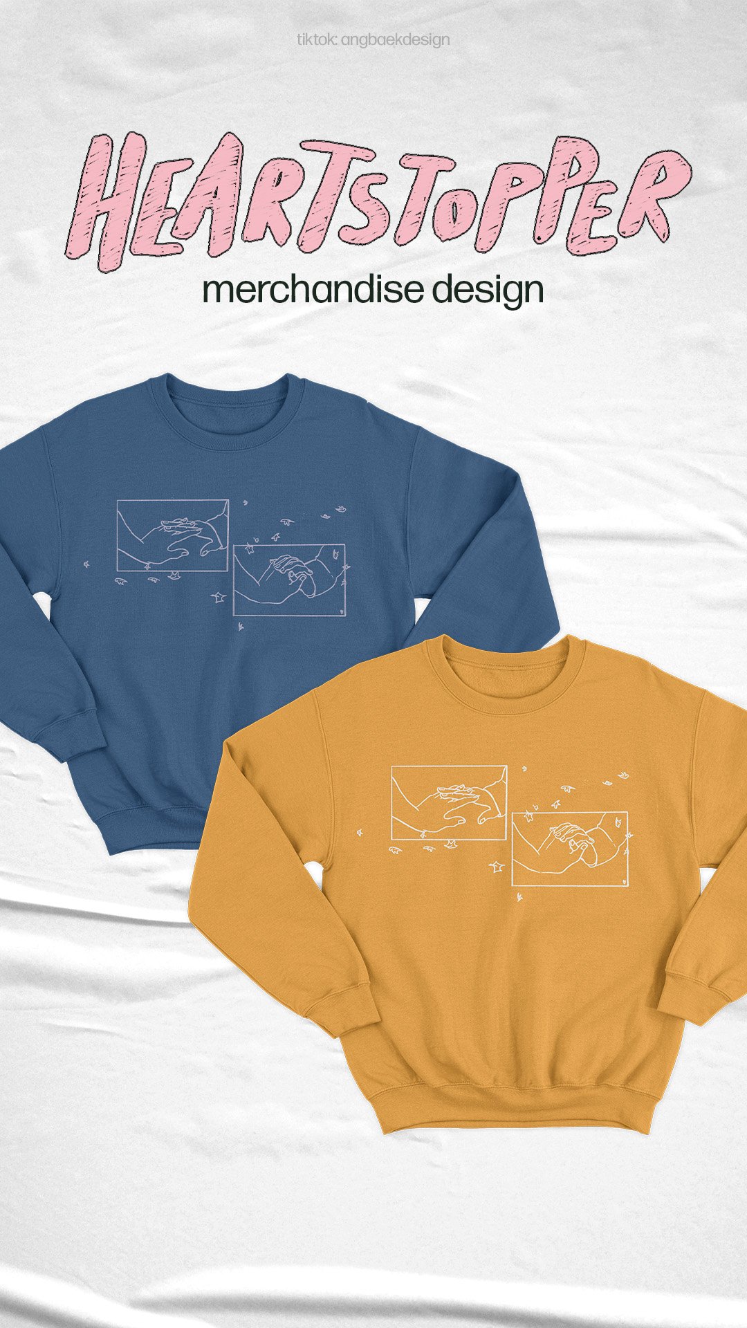
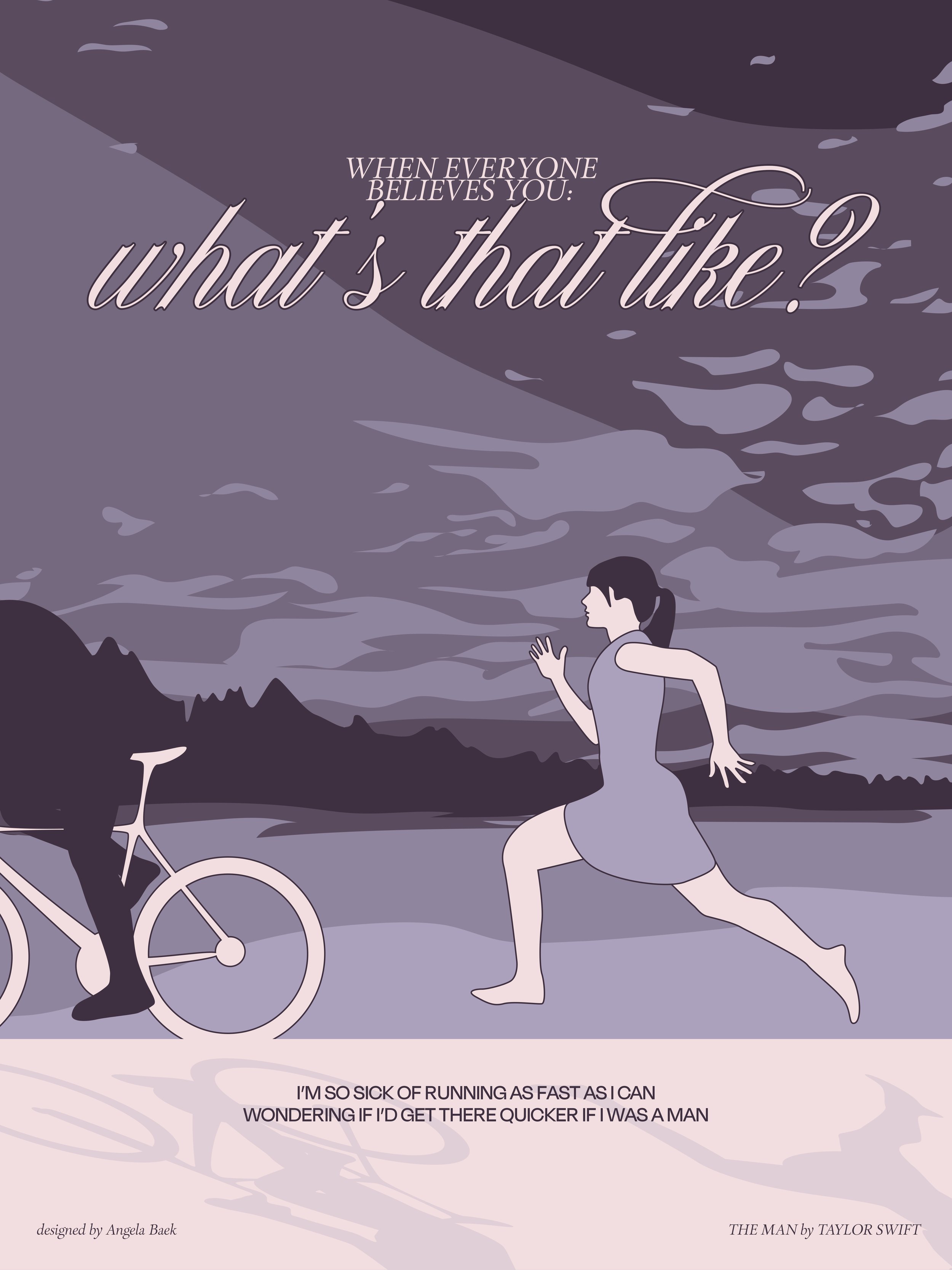
The concept: I listen to a song from an artist I’d never heard before, and based on the first impression (and the vibe I get from the artist from a little social media searching), I design a poster I would want to see as their merch. From a poster, I translate the design into t-shirts, pins, CD covers, or other products I feel go well with the theme. (noted with * below)
May 17, 2021: I get my first artist merchandise inquiry!
We collaborate to design a custom patch for her brand (*not able to showcase on my portfolio, but please email me!). This project was the first of many; from pins and totes, to posters and t-shirts, I’ve had the opportunity to work with artists to create merchandise that’s true to their sound.
“Wouldn’t It Be Nice to Not Care Too?” *
by James the Seventh
The song has a dark theme, with heavy synths and vocal effects. The music is almost unnerving; it’s not your average pop music that you can light-heartedly sing along to.
I wanted to bring these elements of the mood to life. The base of the poster is all black, with different objects and textures layered on top of it, adding a dark theme and mysterious undertone. The rest of the colors are muted, hinting at something that once was shiny. The primary subject is a broken mirror; in addition to its role in the artist’s original album cover, the broken mirror is superstitious, supposedly bringing seven years of bad luck. The design’s focus is the text, its off-white color in harsh contrast against the dark background. The grain effect, combined with the gothic typeface adds that unusual flair reflected in the music and brings all of the elements together.
“I H8 EVERY1” *
by Sarah Barrios
“I H8 EVERY1” is a high-energy pop song: the kind you imagine karaoke-ing with your friends on a midnight drive down the highway in a montage of an emotional coming-of-age movie.
The artist, Sarah Barrios, was inspired by the “enemies-to-lovers” romance trope found in literature. Specifically, she writes about a scenario in which the protagonist is angry at everything in the world, but, for some (annoying) reason, finds themselves liking one person; hence, the repetition of the verse “I hate everyone, but you.”
The neon-like colors (bright pink, with accents of red, yellow, and maroon) add to the high energy of the poster. The focus of the design is the glowing “IH8EVERY1,” where I tried to mimic the effect of spray paint that often epitomizes an act of rebellion. I repeated the same effect in red (circling the artist’s name in the bottom left corner and the artist’s logo in the upper right corner) in order to bring the elements together. The glowing “IH8EVERY1” is repeated once more, lighter, to the left, not only paralleling the repeats in the chorus, but also hinting at the duplicate-effect when neon lights are reflected in glass.When I was designing, I kept the idea of a book cover in mind, adding small lyric-pulls as quotes.
Watch the TikTok: Design at First Listen
“Before, Not After”
by Courtney Govan
If a song can be described as ethereal, it would be “Before, Not After” by Courtney Govan; it sounds as if you were transported to a different universe, floating in the warmth of self-love. The song itself is about body positivity, about loving someone who they are “before, not after” they change their physical appearance to fit what is “acceptable.”
The juxtaposition of the text and the poster itself stands out most: without context, there is disconnect between the delicate prism-like aesthetic of the poster and the words “i can’t find a single fuck to give.” However, with body positivity and the artist’s intentions in mind, it is a beautiful conversation. Instead of the harsh vulgarity that comes to mind with the word “fuck,” the idea of self-acceptance and appreciation establishes the bold statement of “this is my body, and i kindly do not care for your opinions.” The cherry on top with the little heart (<3).
An Easter egg of this design is the faint silhouette of the artist on the center/right side of the poster. The greys, silvers, rose golds, and prism-like rainbows make the poster ethereal.
Courtney’s Response: “I cannot stress how amazing you are. this is BEAUTIFUL! you are so talented and I am so honored to be working with you. I’m ABSOLUTELY IN LOVE.”
Watch the Promotional TikTok Video
“Clementine” *
by Scarlett Taylor
“Clementine” is a light-hearted and care-free pop song, one that might accompany a cute video montage of a summer during your childhood.
The song’s vibe reminded me of the scrapbooks we’d make as a kid, using everything you could lay your hands on to capture a single moment of your life. The elements of the poster, from the clementine cut-outs with a crumbled-paper effect, to the crayon scribbles and sticker details, to the torn-out paper in the background, to the handwritten titles and lyrics, come together to create this vision. The final outcome reminds me a lot of the “Dork Diaries” book covers; it brings me the joy of adolescence.
Watch the TikTok: Design at First Listen
See the Layers behind the Design
“Cherry Cola”
by Elizabeth Gerardi
The artist’s aesthetic is retro, reminiscent of classic mid-1900s Americana. Because the song’s vibe— summery, like driving near the ocean on a hot day, windows rolled down— matches the artist’s strong personal brand, I decided to let these determine my design direction.
I arranged this poster like a retro advertisement; it presents the song not only as sellable (as the title of the song is, after all, Cherry Cola), but also a “product” that guarantees a memorable experience of a moment in time. The border of the poster— the striped, almost sun-beam-like line pattern — is subtle, but it emphasizes the large “Cherry Cola” text. I was inspired by script used in retro advertisements for the type, alluding to the theme of the song and the artist. The colors I chose drive “Americana” home: the reds and blues accompanied with light tans and off-whites.
Elizabeth’s Response: “Working with Angela was an amazing experience and I definitely hope to work with her again for future designs! When creating designs to use for merch for my song Cherry Cola, she really captured the aesthetic and vibe of the sound in ways I wouldn’t have been able to articulate. As an artist, I have a specific brand and aesthetic that I stick to and from looking at my posts she picked up on certain aspects to use while creating something brand new!”
Watch the TikTok: Design at First Listen
From Sound to Sight
translating the language of music to the language of visuals
Music merchandise design is my version of a passion project: it’s something I work on in my free time that both excites and challenges me. It’s like making magic happen— it’s the best feeling when you can bring someone else’s auditory dream to visual life, and it turns into an experience that can be shared with hundreds of people.
Over time, I’ve solidified my process: I start with a mood board that determines the direction I move in, and let that direction and the music itself guide me to the final product. It’s experimental, but with intention.


